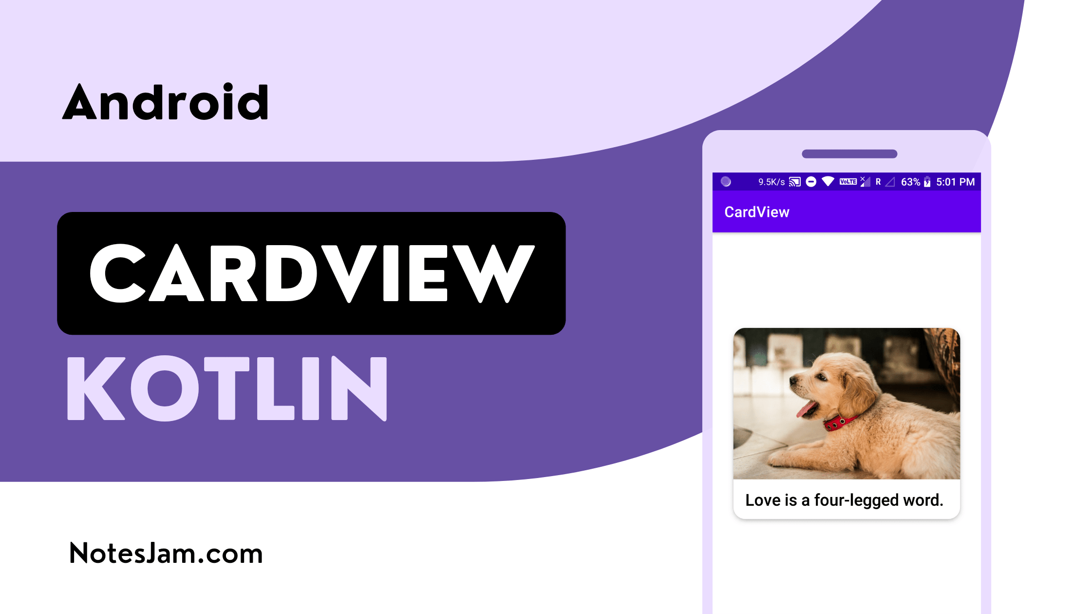
Android CardView is a popular and widely used UI component that allows developers to display information in a visually appealing manner.
CardView provides a flexible and easy-to-use way to create cards that can display images, text, and other UI elements.
In this article, we will learn how to create an Android CardView with an image and text using Kotlin.
Create Project
To begin, we need to create a new Android Studio project. Open Android Studio and create a new project by selecting “Empty Activity” from the “Create New Project” dialog box.
Give your project a name CardView and select the desired minimum SDK version.
How to Create a New Project in Android Studio
Adding dependency
For using CardView in our project we have to add Material Design dependency. Go to the app-level gradle file and find the material dependency. If not found, put the following code in your dependencies block.
Once the dependencies are added, we need to sync our project with Gradle by clicking on the Sync Now button.
implementation 'com.google.android.material:material:1.11.0'
Adding the CardView in Layout
Go to app > resource > layout > activity_main.xml. Add a CardView. Now add a LinearLayout having an ImageView and a TextView.
Here is an example of what the layout activity_main.xml file should look like:
<?xml version="1.0" encoding="utf-8"?>
<androidx.appcompat.widget.LinearLayoutCompat xmlns:android="http://schemas.android.com/apk/res/android"
    xmlns:app="http://schemas.android.com/apk/res-auto"
    xmlns:tools="http://schemas.android.com/tools"
    android:layout_width="match_parent"
    android:layout_height="match_parent"
    android:gravity="center"
    android:orientation="vertical"
    tools:context=".MainActivity">

    <androidx.cardview.widget.CardView
        android:id="@+id/touchCard"
        android:layout_width="match_parent"
        android:layout_height="wrap_content"
        android:layout_margin="28dp"
        app:cardCornerRadius="16dp"
        app:cardElevation="4dp">

        <androidx.appcompat.widget.LinearLayoutCompat
            android:layout_width="match_parent"
            android:layout_height="wrap_content"
            android:orientation="vertical">

            <ImageView
                android:layout_width="match_parent"
                android:layout_height="wrap_content"
                android:adjustViewBounds="true"
                android:contentDescription="@string/card_image"
                android:src="@drawable/dog" />

            <TextView
                android:layout_width="match_parent"
                android:layout_height="wrap_content"
                android:fontFamily="sans-serif-medium"
                android:paddingHorizontal="16dp"
                android:paddingVertical="12dp"
                android:text="@string/love_is_a_four_legged_word"
                android:textColor="@color/black"
                android:textSize="22sp" />
        </androidx.appcompat.widget.LinearLayoutCompat>
    </androidx.cardview.widget.CardView>
</androidx.appcompat.widget.LinearLayoutCompat>
In this layout file, we have created a CardView with a LinearLayout as its child. Inside the LinearLayout, we have an ImageView and a TextView.
To add a drop shadow effect to our CardView, we have used the cardElevation attribute and set its value to 4dp. This attribute controls the Z-axis elevation of the CardView, which determines the size and depth of the shadow.
You can adjust the value of cardElevation to make the shadow more or less prominent, depending on your design preferences.
To give our CardView rounded corners, we have used the cardCornerRadius attribute and set its value to 16dp.
This attribute controls the radius of the corners, and you can adjust it to make the corners more or less rounded, depending on your design preferences.
Kotlin Code
Go to app > java > com.example.cardview > MainActivity.kt and put the following code after initializing cardview.
To add a click listener to our CardView, we have used the setOnClickListener method and implemented a setCardBackgroundColor function to change the background color of the card to light gray.
This provides visual feedback to the user when they click on the card. You can customize the click behavior by modifying the code inside the callback function.
// Changing card background color on clicking the card
touchCard.setOnClickListener {
    touchCard.setCardBackgroundColor(Color.LTGRAY)
}
Below is the final Kotlin code for our MainActivity. You can copy the following code and paste it directly into your MainActivity.kt file.
package com.example.cardview

import android.graphics.Color
import androidx.appcompat.app.AppCompatActivity
import android.os.Bundle
import androidx.cardview.widget.CardView

class MainActivity : AppCompatActivity() {
    private lateinit var touchCard: CardView

    override fun onCreate(savedInstanceState: Bundle?) {
        super.onCreate(savedInstanceState)
        setContentView(R.layout.activity_main)
        touchCard = findViewById(R.id.touchCard)

        // Changing card background color on clicking the card
        touchCard.setOnClickListener {
            touchCard.setCardBackgroundColor(Color.LTGRAY)
        }
    }
}
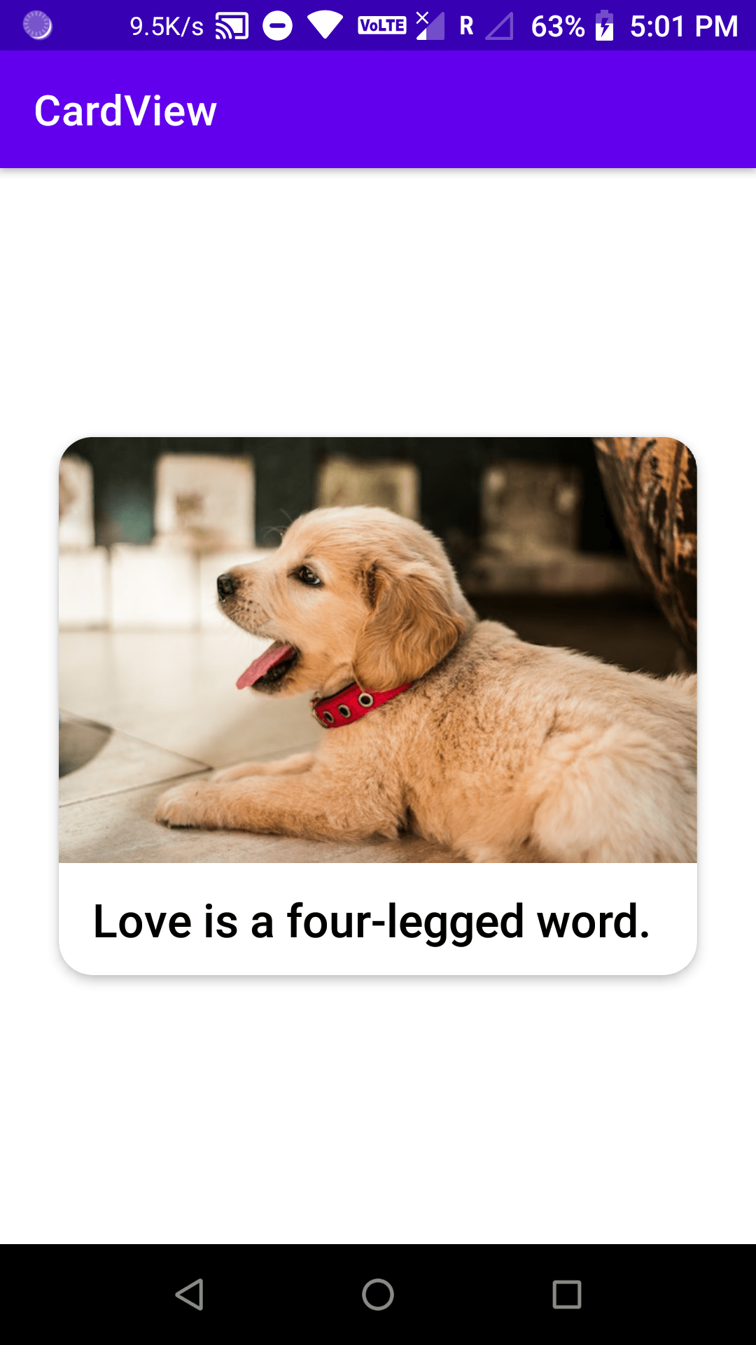
Output
To test the application, we need to run it on an Android device or emulator. Once the app is launched, if we click on the CardView with the ID touchCard, the background color of the card should be turned light grey. Here is the final output.
Conclusion
CardView is a useful component in Android development that allows us to create dynamic and visually appealing user interfaces.
In this article, we have demonstrated how to create a CardView with an image and text using Kotlin and customize it by adding a drop shadow effect, rounding the corners, and adding a click listener.
By following the steps outlined in this article, you should now have a solid understanding of how to use CardView in your own Android projects, and how to customize it to achieve your desired design.
As always, don’t hesitate to experiment with different attributes and settings to find the perfect look and feel for your application.


Leave a Reply